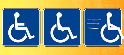
It's time to redesign the accessibility logo
This iconic symbol is outdated and perpetuates dangerous stereotypes. It's time for something new.


People with disabilities are on the move! From the workplace to the Broadway stage, inclusion is happening in a big way and strides toward better and more accurate disability representation are being made every day.
And if the Ohio legislature had its way, progress in disability representation would extend to one more area: the accessibility logo. Lawmakers in that state have been trying to redesign the International Symbol of Accessibility — which currently shows a disabled person sitting stagnant in their wheelchair — to better reflect the reality that people with a disability are active and independent.
Ohio's Democratic Senate Minority Leader Kenny Yuko began pushing for the amendment to the buckeye state's transportation budget after a particularly affecting conversation he had with a friend who had multiple sclerosis.
Subscribe to The Week
Escape your echo chamber. Get the facts behind the news, plus analysis from multiple perspectives.

Sign up for The Week's Free Newsletters
From our morning news briefing to a weekly Good News Newsletter, get the best of The Week delivered directly to your inbox.
From our morning news briefing to a weekly Good News Newsletter, get the best of The Week delivered directly to your inbox.
"He just took offense to the fact that the signage that we use to indicate that someone is in a wheelchair showed a person sitting long and tall and erect in the chair waiting for someone to push them, like they were totally dependent on somebody else," Yuko recalls. "He said he saw a sign that showed the person leaning forward in the chair, almost indicating that they're self-mobilized and they can get around without anybody's help."
In June, the Federal Highway Administration told the Ohio Department of Transportation that the new logo could result in the state losing federal funding because it would violate rules that stipulate traffic control devices be "unmistakably similar" to those in its manual. So the redesign efforts have hit a snag, and the plans are being put on hold for now. This is incredibly disappointing news, to say the least. A revamped, more modern logo would go a long way toward changing public perception about what it's like to live with a disability in 2019.
The current accessibility logo is certainly overdue for an upgrade. It was created in a design competition and adopted by the independent International Organization for Standardization way back in 1968, and it is outdated, both in style and in the stereotype it perpetuates. It reinforces misconceptions about people with disabilities being helpless and wholly dependent upon others. The logo has certainly been met with criticism over the years, but past attempts to change it have failed; in March 2017, the United States Access Board, which serves as the official authority by writing federal accessibility rules, released guidelines saying that alternative symbols would comply with the Americans With Disabilities Act only if they result in "substantially equivalent or greater accessibility and usability."
There's a lot of work still left to be done when it comes to disability acceptance and inclusion, and a little logo might seem low on the list of priorities. But it's more than just a logo. It's a nationally recognized symbol (perhaps even internationally recognized), and it's iconic in that it tells the world exactly who we are. The current design sends the message that people with disabilities are immobile and "stuck" — that we're not in charge of our own lives.
As someone with a disability, I am here to tell you just how inaccurate and outdated that message is. We are a vibrant, independent people who aren't sitting around, dependent on others. While some of us may be literally sitting in our wheelchairs (I've had a wheelchair all my life), we lead full and active lives every single day. I often say that living with a disability is a verb in every sense of the word; that's something the able-bodied community tends to forget sometimes. People with disabilities are working, socializing, shopping, vacationing, and just generally going about their lives. The last thing we're doing is waiting for someone else to help us get somewhere.
Maybe that's why I feel so strongly about the power of the accessibility logo's proposed redesign. A logo that shows someone in a wheelchair propelling themselves forward could instill a better image of people with disabilities in the national mind. Every day, I and millions of others in the disability community fight stigmas and stereotypes. Showing us as we really are, even if it's only in an illustration, would be a powerful way to help us be seen and better understood.
Create an account with the same email registered to your subscription to unlock access.
Sign up for Today's Best Articles in your inbox
A free daily email with the biggest news stories of the day – and the best features from TheWeek.com
Melissa Blake is a freelance writer and blogger from Illinois. She covers disability rights and women's issues and has written for The New York Times, Cosmopolitan, Good Housekeeping, Glamour and Racked, among others. Read her blog, So About What I Said, and follow her on Twitter.
-
 'Republicans want to silence Israel's opponents'
Instant Opinion Opinion, comment and editorials of the day
By Harold Maass, The Week US Published
-
 Poland, Germany nab alleged anti-Ukraine spies
Speed Read A man was arrested over a supposed Russian plot to kill Ukrainian President Zelenskyy
By Peter Weber, The Week US Published
-
 Today's political cartoons - April 19, 2024
Cartoons Friday's cartoons - priority delivery, USPS on fire, and more
By The Week US Published